Accessibility checklists usually focus on screen readers, color contrast, and keyboard navigation. These are essential. But they address motor and visual impairments, not sensory and cognitive ones. For neurodivergent users — ADHD, autism, sensory processing sensitivity — the barriers are different. They are caused by design choices that most developers never think about. This checklist is based on our neurodivergent design philosophy and the principles in our post on why streaks are hostile.
The checklist
Motion and animation
- Respect prefers-reduced-motion — If the OS setting is on, disable all non-essential animation. No fade-ins, no slide-ins, no parallax. This is a CSS media query, not a JavaScript check.
- Default to reduced motion — Do not wait for the OS setting. Make reduced motion the default and let users opt in to animation. This is what Glassy does.
- No auto-playing video — Ever. No exceptions. Autoplay is a sensory assault.
- No animated notifications — Notification badges should appear, not bounce. Badge counts should be static numbers, not pulsing red circles.
Color and contrast
- No red notification badges — Red is the color of danger and urgency. Using it for unread counts creates a constant low-level stress response. Use a neutral color instead.
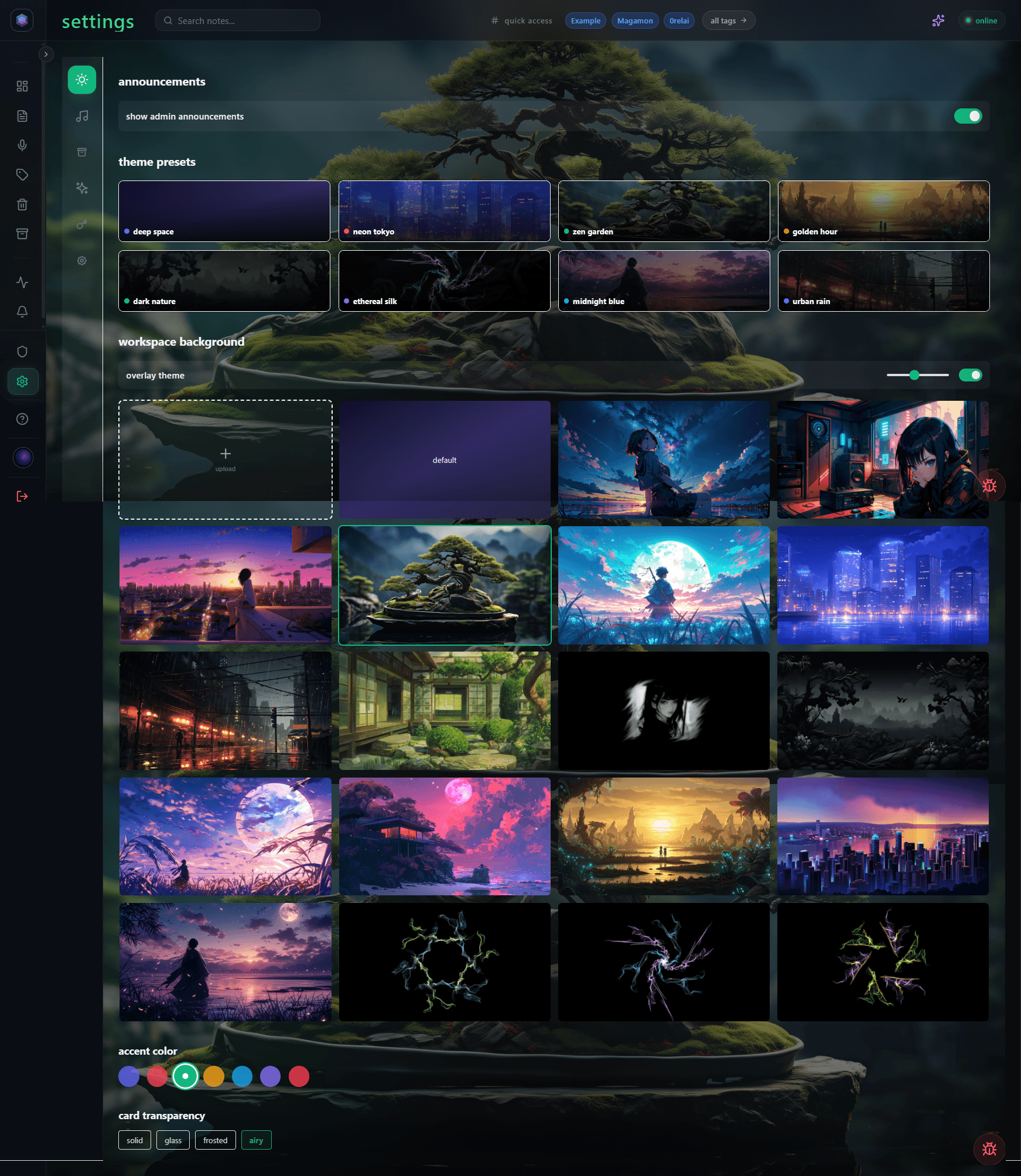
- Avoid high-saturation backgrounds — Bright colors in peripheral vision are distracting. Use muted palettes for chrome and navigation.
- Support dark mode — Not as a preference, as a first-class option. Many neurodivergent users are photophobic. Light mode is painful.
Cognitive load
- No streaks, badges, or gamification — These create anxiety, not motivation. See why streaks are hostile.
- Minimize decision points — Every modal, dropdown, and "choose a folder" prompt is a tax on executive function. Default to smart defaults. Let users change them later.
- No empty-state shame — "You have not captured anything yet!" is not motivating. It is guilt-inducing. Show a neutral empty state with a single call to action.
- Single-action capture — One shortcut, one click, one button. No multi-step wizards for common actions.
Notifications
- No push notifications by default — Notifications are interruptions. Ask permission, do not assume consent.
- No "you have not used the app in X days" emails — These are guilt trips dressed as helpfulness.
- Batch notifications — If you must notify, batch them into a daily digest. Do not send one notification per event.
Information density
- Collapse by default — Sidebars, panels, and metadata should be collapsed. Let users expand what they need. Do not show everything at once.
- Focus mode — Provide a way to hide everything except the current task. No sidebar, no counts, no distractions. Glassy has this.
- No infinite scroll — Pagination or "load more" buttons give users control over how much content they see. Infinite scroll removes that control.
Language and tone
- Plain language — No jargon in UI text. "Settings" not "Configuration Parameters." "Search" not "Query the Knowledge Base."
- No guilt language — "Are you sure you want to delete?" is fine. "You will lose everything!" is not.
- No FOMO copy — "Don't miss out!" "Limited time!" "Join 10,000 others!" These create anxiety, not engagement.
How Glassy implements this
Glassy was designed from the first commit for neurodivergent brains. Here is how we implement the checklist above:
- Reduced motion is the default. Animations are opt-in.
- No red badges. No notification counts. No streaks.
- Capture is one shortcut or one click. No folder prompts, no tag requirements. AI auto-tags on its own time.
- Focus mode collapses everything except the note you are writing.
- No push notifications. No "we miss you" emails. No FOMO copy anywhere in the product.
- Semantic search means you do not need to remember tags or folders — find notes by meaning.
See our broader post on best note-taking tools for neurodivergent adults for how this philosophy compares to other tools.